
Toyota
Toyota
Project Overview:
Financial Program Kiosk for Toyota
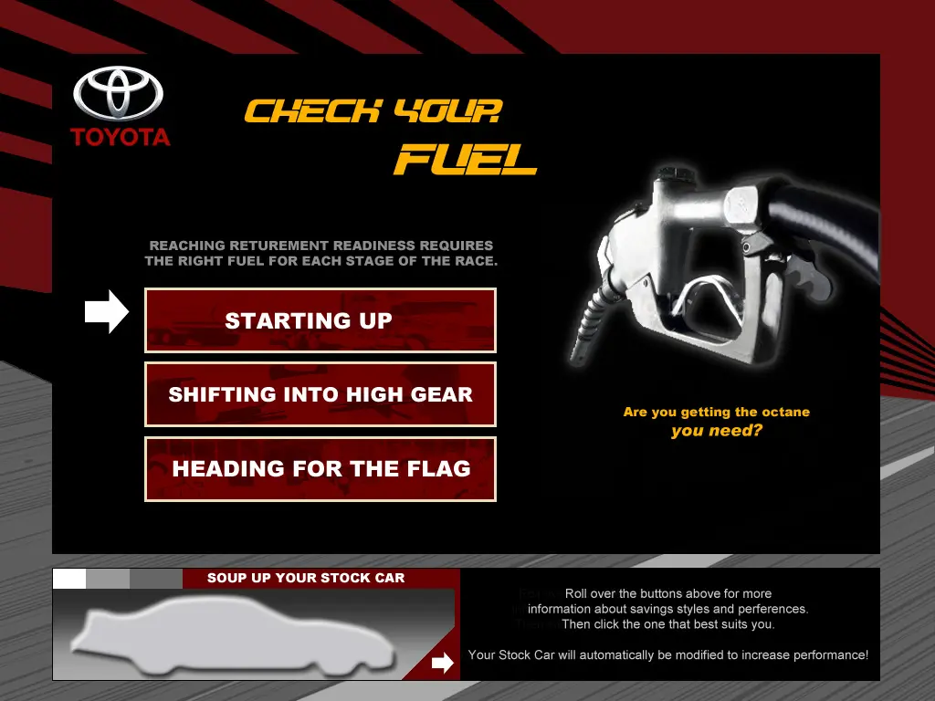


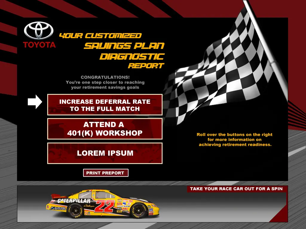

Toyota
Project Overview:
Financial Program Kiosk for Toyota
Create a dynamic, fun, and educational experience that supports Toyota employees in achieving their financial goals and planning for a secure retirement.*
* full process and applications screen designs and interaction protected as proprietary company materials
Project details
Author
Conlee Idol
Client
Toyota Motor Company
Project location
California, USA
Summary:
Toyota is excited to introduce an interactive kiosk at their company-wide meeting, aimed at educating employees about the financial programs available through Fidelity. This engaging and easy-to-navigate kiosk will focus on retirement planning and money management, using a fun "Are you on track to cross the finish line" motif to make learning enjoyable. The kiosk will feature a user-friendly interface with multimedia content, personalized financial advice, and gamified elements to keep employees engaged. The kiosk reflects Toyota's commitment to employee well-being, blending innovation and reliability with an approachable tone. By targeting employees of all ages and financial literacy levels, it ensures everyone can access valuable insights and resources. The ultimate goal is to increase awareness, empower informed decision-making, and provide a positive, interactive experience that aligns with Toyota's brand values.
UX Research & Design:
I interviewed stakeholders of all ages and positions on the organizational chart from the clients’ companies to gather their knowledge and interest levels in the corporate financial programs, and the gist of information that would be provided via the kiosk. Next Iarsed and organized the feedback to assist the client with whittling down information packets into a summary user journey that could be encapsulated in a digital experience.
At this point Ireated UX components to visually articulate my findings:
- User personas
- User journey
- Wireframes
- Prototype
For the design, I envisioned a race track concept with the motif: “Are You on Track to Cross the Finish Line” and presented this idea to the client in a slideshow. They were sold on the concept’s inherent energy and sense of excitement which juiced up concepts that might otherwise seem heavy and a little dull. The motif was also a perfect fit for branding (i.e. The Toyota Red primary color paired with it’s functional black, white, and grey shades provided a balanced look and feel in the application’s communications.) Once the client was on board with the structure and design choices, I created a mockup so we could complete a round of user testing.
Finally the kiosk entered the development phase, and after another round of user testing, was shipped for incorporation in the kiosks and ready for use.