Enclus Beauty
Project Overview:
Ecommerce Website & Internet Presence for Enclus Beauty


Enclus Beauty
Global Brand Imagining
Project Overview:
Ecommerce Website & Internet Presence for Enclus Beauty
Create an exciting, inclusive online environment for a luxury beauty brand with a diverse audience.
Project details
Website
social reels
instagram.com/enclusionary/reelscampaign presentation
internet presence / brand awarenessClient
Enclus Luxury
Author
Conlee Idol
Project location
Los Angeles, CA, USA
Summary:
Enclus Luxury embarked on a project to create an inclusive, luxurious beauty website that celebrates diversity and empowers users. The website's goal was to provide an engaging, easy-to-navigate platform that showcases beauty products and content — with a focus on creating a welcoming space for all users.
The design incorporated the motif "Unlocking a Spectrum of Stunning Possibilities," aiming to make the user experience enjoyable and inspiring. The site featured a user-friendly interface with multimedia content, personalized recommendations, and interactive elements to keep users engaged. The overall objective was to increase awareness, promote genuine inclusivity, and provide a positive, luxurious online experience that aligns with Enclus Beauty's brand values.
UX RESEARCH & DESIGN
Ecommerce Website for Inclusive Luxury Beauty
Enclus Beauty came to me with a clear ambition: build a luxury beauty e-commerce experience that genuinely includes everyone — without the performative diversity so common in the category. I began with a discovery sprint: stakeholder workshops with the founding team, and qualitative interviews with potential users across a wide range of skin tones, gender identities, and shopping motivations. Those conversations were direct about what was broken. Shade ranges that stop at medium. Navigation built around a gender binary. Ethics pages that are single paragraphs of marketing copy with no certifications, no sourcing data, no names. Trust that evaporates at the first vague claim.
That research is shaping every IA decision that follows — from which items sit in primary navigation, to what a product page has to prove before someone adds to bag.
A look at where the process led — scroll to see the full UX work behind these designs.
The Process
Step 1
User Personas
Four archetypes emerged — built around purchase drivers and trust thresholds, not demographics. Aria Mensah (The Conscious Luxurian, London) needs shade depth as her first proof of authenticity: if the deepest shade is one of two options, she's gone. Dev Kapoor (The Boundary-Free Explorer, NYC) won't tolerate gendered navigation or a "for him/her" aisle. Solange Ribeiro (The Aspirational Gifter, São Paulo) needs smart gift curation tied to the recipient's skin tone specifically. Nadia El-Amin (The Values-First Newcomer, Dubai) treats a single vague ethics claim as a dealbreaker — a specific, verifiable proof point can earn lifetime loyalty. Each persona directly shaped a navigation node, a feature requirement, or a content standard.

Step 2
Journey Maps
Two journey maps were developed in depth. The Shade & Skin Match map (primary: Aria; supporting: Dev, Nadia) traces the full arc from a "Find Your Match" homepage CTA through quiz, filtered results, PDP, and cart — surfacing the specific moments where shallow shade ranges or text-only shade names cause dropout. The Brand Values & Ethics Verification map (primary: Nadia; supporting: Aria, Dev) models a parallel journey that runs alongside every shopping session: passive scan → claim encounter → active search → deep dive → verdict. This map drove the entire ethics IA: every claim on a PDP must link to a dedicated sourcing page; every certification badge must link directly to its certifying body.


Step 3
Site Map
The global navigation was built around three constraints the journey maps made non-negotiable: skin-tone browsing, Find Your Match, and Ethics as primary wayfinding anchors — not secondary features. "Browse by Skin Tone" and "Find Your Match" sit in primary nav as peers of "Shop." "Our Ethics" is a homepage CTA reachable in two clicks from any page. "Gift" is a permanent nav node, never hidden on scroll. The resulting IA spans six primary sections — with the Shade Finder quiz, Tone Spectrum Browser, and Sustainability Hub treated as first-class destinations, not subcategories buried inside product filters.

Step 4
User Flows
Four journey-map-aligned flows validate the IA before any wireframe is drawn. The Shade Discovery flow handles first-time buyers arriving without shade knowledge — routing through selfie upload (AI analysis) or manual tone selector before a matched results page. The Browse by Skin Tone flow serves exploratory buyers who filter by tone rather than category. The Gifting Flow opens from the permanent Gift nav node and filters first by recipient shade, then by budget and product type. The Ethics-Led Discovery flow models the values shopper entering through the homepage Ethics CTA, moving through the Sustainability Hub, and reaching a filtered "Shop Clean" PLP — all before touching a standard product category.

Step 5
Wireframes
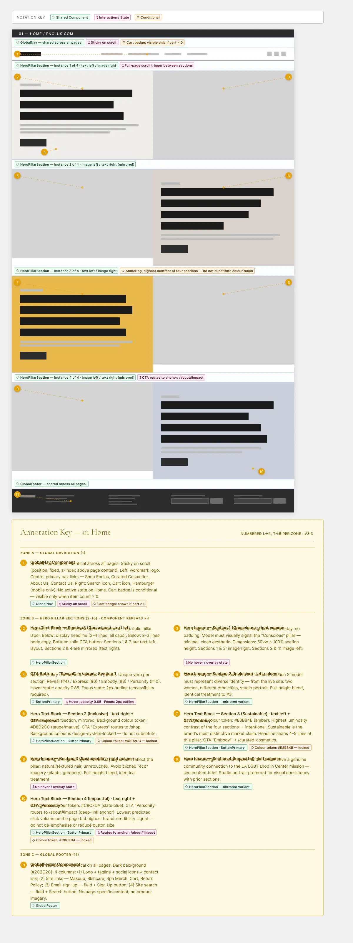
Low-fidelity wireframes establish the homepage's structural logic before visual design enters the picture. The layout resolves a central tension: the page must simultaneously serve the first-time shade-seeker (lead with "Find Your Match"), the returning values shopper (Ethics CTA above the fold), and the gift buyer (Gift as a persistent nav anchor). Four HeroPillar sections carry these distinct audiences — alternating text/image layout, with the amber-background section signaling the Sustainable pillar as the brand's highest-contrast market claim. GlobalNav and GlobalFooter are documented as shared components, defined once and reused across all pages without modification.
MARKETING
Email, Social Media
www.instagram.com/enclusionary/reels
www.tiktok.com/enclus


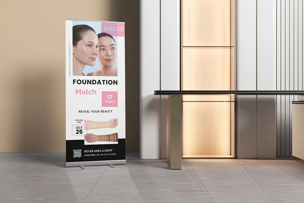
Packaging & Event Collateral